Welcome
Introduction
Welcome to the documentation for the most advanced and sophisticated trading products for the private user. Extensive experience in software development and trading has allowed us to overcome common challenges in mastering automated trading. This documentation stands out from the myriad of half-baked, poorly tested, and confusing products offered by numerous other providers. The introduction article provides a glimpse of what you can expect from a comprehensive and well-structured product documentation.
Anyone delving into automated trading will inevitably encounter the term expert advisor. Expert advisors are applications embodying and executing an automated trading strategy. In recent years, there's been a surge in interest in so-called trading bots and algo trading tools. However, most software solutions fail to meet modern professional development standards due to not following fundamental coding principles.
In contrast, an automated trading system is a complex software developed over years with invaluable input from professional traders, investors, and developers. This type of collaboration has shaped the trading framework presented in this documentation, resulting in more than 500,000 lines of object-oriented and extensively tested code fully dedicated to automated trading. The products found in this documentation frequently utilize the same components of this framework, making it unique and user-friendly for beginners, intermediates, and even professional traders or investors. You can start immediately with a simple Stop Loss Manager and soon implement your own fully automated trading strategies with a state-of-the-art web-based Expert Advisor Builder for the Expert Advisor Builder.
The user-friendly and easy-to-understand products are accompanied by this comprehensive documentation divided into three categories:
- Getting started: These articles provide a basic introduction to each product and the operating principles and guide you through the initial steps of practical usage.
- User manuals: Given that a getting started article cannot encompass each functionality of the products, you can access a detailed user manual for each product. These manuals thoroughly explain every function and input parameter.
- Tutorials and examples: To simplify the learning process, especially for the more feature-rich products like the Expert Advisor Builder, numerous examples to facilitate learning by doing are offered.
It is recommended to start with the getting started articles, then move on to the tutorials and examples, and finally delve into the user manuals. You might not need to read the entire user manual, depending on your expertise. However, starting with a demo account before transitioning to live trading is advised once you're comfortable with the product. The documentation emphasizes learning through examples and illustrations, adhering to the philosophy of minimizing textual explanations. However, if you have any questions or encounter inconsistencies, please don't hesitate to contact us at contact@fea-trading.com.
If you want to read this documentation in your native language, you might want to install a translation tool like Google Translate. If installed, you can right-click anywhere on this page and choose Translate to to translate and read this documentation in another language.
The trading framework
Let's start by discussing the trading framework and how each product is derived. In contemporary software development, code reusability is highly desirable. Ideal code is written in a way that allows it to be reused across different products. A practical analogy would be the engine of a car. Many car manufacturers use the same engine in various models.
When you begin with the Stop Loss Manager or Meta Extender, you'll notice similarities to the Expert Advisor Builder. Especially if you plan to use the Expert Advisor Builder, it's advisable to start with the Meta Extender, as it allows you to use the same features with a user-friendly interface. It helps you understand the best practices and principles. For instance, the inspector module oversees performance and drawdown and is used across various products.
Let's delve into the product portfolio. The following illustration shows a graph that positions each product based on the recommended skill level and degree of automation.
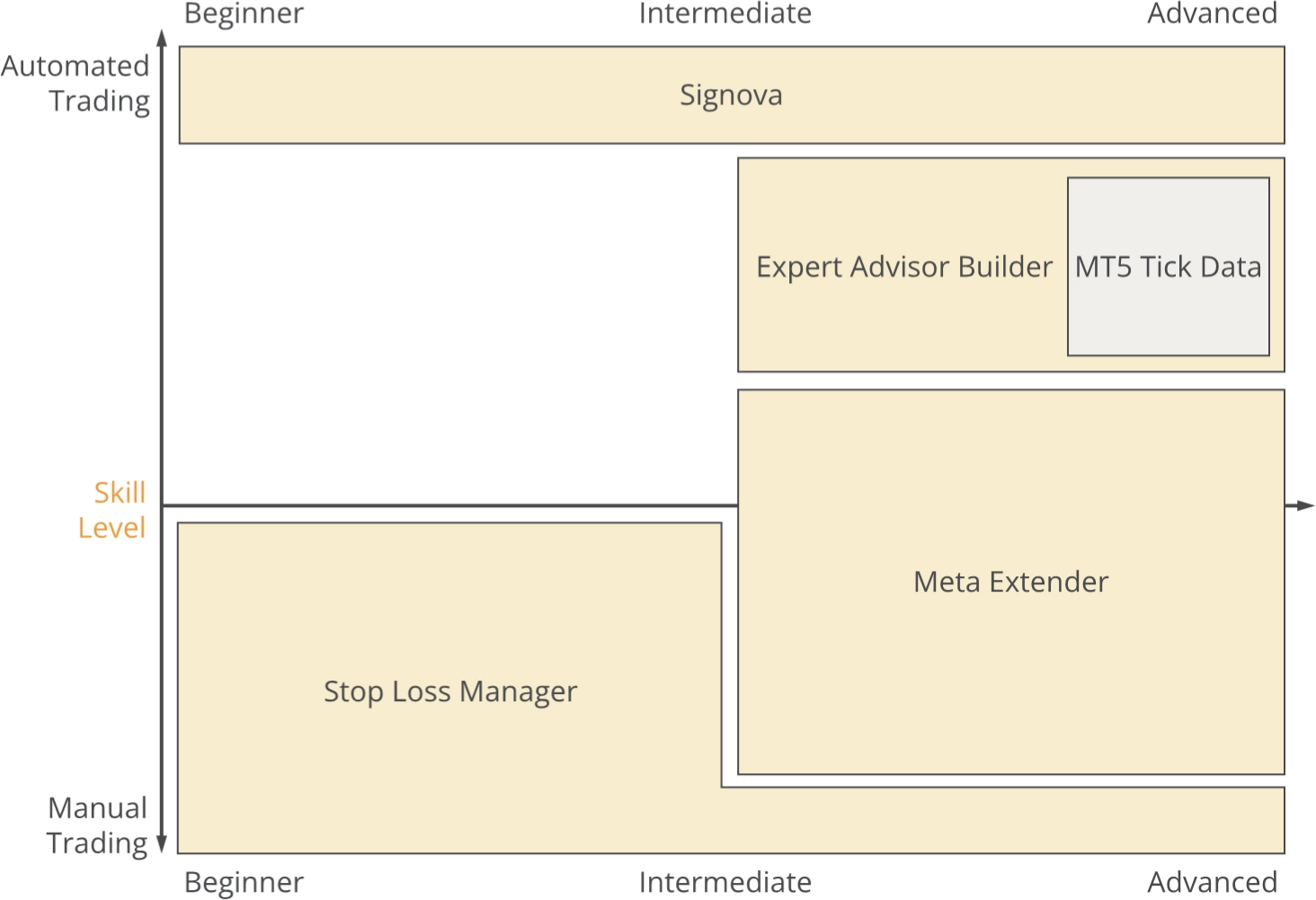
The two terms are defined as follows:
- Automated Trading: Refers to software that independently and automatically makes decisions to open, manage, and close a trade.
- Manual Trading: Using a trading platform, a human makes manual decisions to open, manage, and close a trade.
There are various stages between those two types of trading. For instance, a fund manager might use an automated trading system but must still approve the suggested trades. Technically, this is a fully automated system, but regulatory requirements necessitate a human being to make the final decision. Thus, manual trading is still a part of this system, albeit a tiny percentage of the decision-making process.
On the other hand, a day trader might be informed directly in the price chart with news information such as ECB data and use this information to derive trading signals from it. It is a trading system that is technically entirely manual, but by showing events in a chart, a filter logic decides which news is delivered to the trader. Thus, a trading system like this consists of a tiny percentage of automated trading, while the vast majority of the system is considered manual trading.
The products outlined in this documentation are categorized as follows:
- Signova: Signova is FEA Trading's fully automated trading algorithm designed for MetaTrader 4 and MetaTrader 5 platforms. This algorithm executes trades autonomously based on predefined trading logic, requiring continuous operation for uninterrupted trading. The system is engineered with institutional-grade standards to provide sophisticated automation for retail traders.
- Expert Advisor Builder: The Expert Advisor Builder is a runtime environment that executes automated trading strategies on MetaTrader 4 and MetaTrader 5 platforms without requiring programming knowledge. Users design strategies visually in the web-based Expert Advisor Builder, then export them as text-based trading module files. The interpreter reads these modules from a designated folder and executes trades according to the defined logic. It can manage multiple trading modules simultaneously, each operating independently with its own signals and risk management. Modules can be added, removed, or modified during runtime without interrupting live trading, providing flexible strategy management.
- MT5 Tick Data: Proper development and testing of trading strategies requires accurate historical chart data for an extended period. To access this data type, you can subscribe to up to 26 major and minor symbols, each available in three different spread variants. The MT5 Tick Data includes tick precise historical data for up to 20 years into the past.
- Meta Extender: This is an in-chart user interface that provides semi-automated trading tools and convenient widgets for managing aspects like trade splitting, trailing stop losses, risk and money management, an automated trading journal, and much more. With a home screen, you can select from various widgets designed to support you in trading.
- Stop Loss Manager: A straightforward application that automatically sets the stop loss for newly opened trades based on the current market conditions. If the price moves in favor of a trade, the application will adjust the stop loss according to the chosen trailing method. Selectable trailing methods are market trailing, average true range trailing, parabolic SAR trailing, fixed distance trailing, and breakeven trailing.
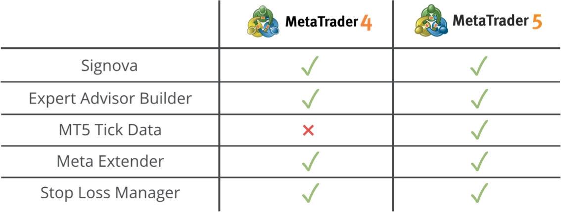
All products were developed using the programming languages MQL4 and MQL5 and can be executed with any MetaTrader 4 or MetaTrader 5 trading platform. The MetaTrader is a widely used trading platform catering to beginners learning to trade and professionals managing accounts with millions. From a development perspective, the MetaTrader platform is more of an integrated development environment (IDE) rather than only a trading platform. Thanks to the strong similarities and virtually limitless possibilities of the MQL4 and MQL5, the MetaTrader can be expanded with a vast range and variety of applications, such as the products listed above.
The trading framework is an entire software layer specifically designed for automated trading.
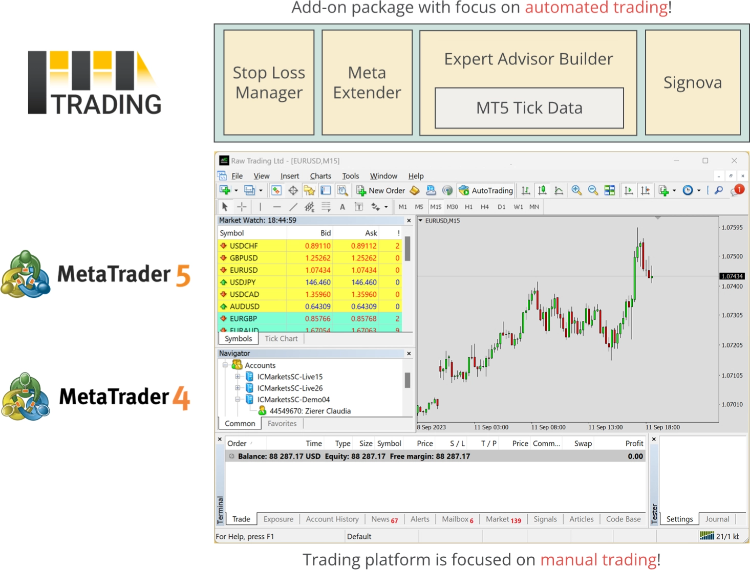
Abstraction in software is a common approach to simplifying complex topics into user-friendly, small, and easy-to-understand products. The aim was to identify all reusable tasks in developing automated trading systems and package those into different products for various skill levels. The products are affordable subscriptions for everyone regardless of skill level or financial possibilities. With the products derived from the trading framework, you can trade manually but with algorithm support or instruct an application to trade autonomously. None of the products require coding skills or the need to write code.
From a coder's perspective, a chart is merely a series of numbers. Hence, there was no need to adapt the trading framework exclusively to forex, indices, futures, or stocks. Therefore, all products are compatible with any asset supported by the MetaTrader 4 or MetaTrader 5 trading platforms. For example, you can use the products to trade derivatives such as forex CFDs or real stocks with an MT5 investment account!
The applications are usable with the following trading platforms.
If you're new to MetaTrader or trading in general, please also take a look at the introductory articles that cover the most basic concepts: